There are tons of repetitive tasks to perform while making a UI design. But we have smart features of Figma like Auto-layout, components, and constraints that cut down the busywork and let us design smartly. Hello readers, this is Anuradha Sengar and today I’m going to talk about the smart UI designing options of Figma.

I’m listing down all the features one by one into 6 parts with practical explanation for your ease. You just have to follow my explanation step by step and try everything practically simultaneously. This blog is for all budding designers who are in UI UX Design Courses or exploring by themselves.
Make sure to comment your doubts and work progress so that I can help you improve it. Let’s start now.
Part 1: Auto Layout
What is it?
Auto Layout is a property that we apply on elements like text, shapes and images. It adds a frame and automatically adjusts the inner elements of that frame. Auto Layout is actually a powerful feature for building responsive designs. You can easily covert you compact sized designs into a medium or even large screen devices using it.
So, we use Auto Layout because:
- It saves our time: We don’t have to do adjustment like maintaining alignment or changing spacing between two elements manually.
- We can quickly make responsive designs: Just enable the Auto Layout option, set padding, and gap and your designs are now ready to adapt space automatically. You can test it by removing or adding extra elements in the group.
- We can maintain consistency throughout the design: Auto Layout gives us a consistent spacing system that is easy to customize and its changes are visible on the elements added into it.
Practical Exercise: Building a Button with Auto Layout in Figma
Now we know what is Auto Layout, so it is right time to start using it practically in Figma. Just follow my below steps.
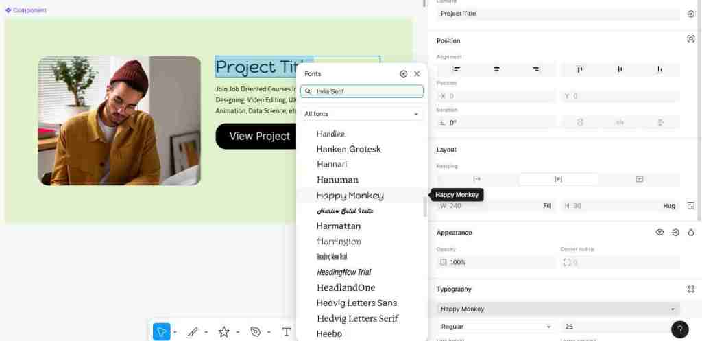
1. Create your elements first: Select Rectangle tool and draw a rectangle without any frame layer. Add border radius of your choice. Then add a text layer and type “Click Me” as shown in the image.
2. Apply Auto Layout: Select both the text and rectangle layers and press Shift + A shortcut key to apply Auto Layout. Or you can select Auto Layout option from right panel. Once the option is applied, you’ll see a new frame around the rectangle. It’s your Auto Layout frame that bounds the text and shape layers together.

3. Adjust the spacing: Now start exploring the right-hand panel as it has all the settings.
- First find Horizontal and Vertical padding and set them 24px and 12px respectively. Set alignment as centre and you are done.

4. Test it out: Now, let’s try changing the text to “Download Now” and see how the button frame automatically resizes itself. This is the magic of Auto Layout!

Part 2: Constraints
What are they?
The concept of constraints is just opposite of what we have in Auto Layout. Constraints are active when there is an element added in a frame. They are active on inner element not on frame layer. Under constraints concept, child layer or inner element layer adjusts itself when its parent frame is resized. While in Auto Layout, frame is resized when its inner elements are changed. Hope you got it clear.
When to use constraints?
You can use constraints to pin elements like shapes, text, image, buttons, etc. to a specific part of the frame. Let’s understand their use practically.
Practical Exercise: Pinning a Logo in a Header using Constraints in Figma
1. Create a header frame: Start by adding a frame of width 1440px. Now draw a rectangle of the size 1440px x 80px. Change color of frame to dark grey and make rectangle’s color white, you will end up by making a basic header layout. Match it with the below given image.

2. Add a logo to the header layout: Take any shape tool like Star and draw it on white rectangle. Add text like “Star Logo” and place it next to star icon. You dummy logo is ready. Now group shape and text and place them in the top-left corner. Match it with the below given image.
3. Apply constraints: Now, we will apply constraints to the logo. For this, select your logo and check the right-hand panel where you will fund “Constraints”. Under it, you’ll see options for both horizontal and vertical constraints.
- Set horizontal constraint as Left and vertical as Top.

4. Test it out: Grab the right edge of the main frame and drag it to resize. You will see that our logo will stick to the top and left corners.

5. Try another constraint: Let’s edit the constraints on other sides. First undo your resize actions. Now, select the logo again and give it Right and Top constraints. Try resizing frame again and this time logo should be pinned on top-right corner.

Part 3: Smart Selection using Tidy Up
Tidy Up
This is a useful feature that automatically organizes elements and distributes their spacing efficiently. This option comes under Smart Selection. Tidy Up recognizes thesimilarly-sized objects and format them in one click.

How to use Tidy Up option in Figma:
To use this option, first make some objects. For basic demonstration, I’m using the last logo that we saw in the example of constraints. Duplicate the same logo 3-4 times and select all of them.
Select “Tidy Up” option from Position on right.
After tidying up, you can use the little purple circles and lines that appear between elements to adjust their spacing at once.
Part 4: Making and Editing Components
What are Components?
I feel like if components were not there in Figma, then you couldn’t think about a smooth workflow at all. It’s hard to imagine working on a design system without using components. They are the building blocks of UI designs in Figma.
Components are reusable UI elements like you can say buttons, icons, multi-level cards, or the entire navigation bar. You can use them throughout your design on multiple pages and frames.
There is always a main component which holds the actual appearance and whatever change we make on it is visible on its copies known as instance. We use instance everywhere in the design and do all editing on main component.
Why use components in UI Designing?
- Easy customization: Just update the main component once and see the changes on all of its instances which are placed on multiple frames.
- Maintain a consistency: We use components to maintain consistency in design across the entire project.
- Make your workflow smooth: We can access instances of main components from Assets panel anytime. Simply drag-and-drop them into your designs and finish your work quickly.
Practical Example of Creating a Reusable Product Card
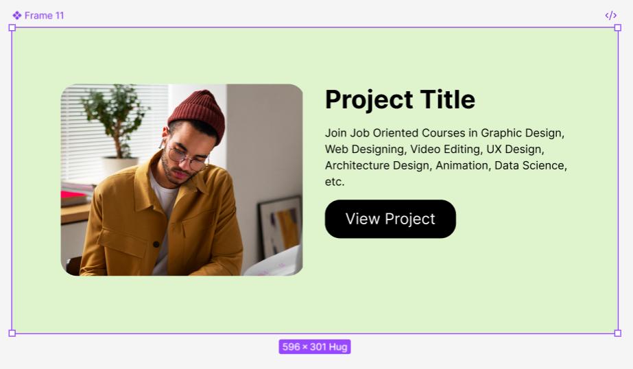
1. Design the product card: First make a frame and add a rectangle on left side for a product image. Then add two text layers for title and its description. At last, create a button or use Auto Layout button we’ve made earlier.

2. Create the master component: To create component, first select the entire card frame then press CTRL+ALT+K. You can also click the Create Component icon (four filled diamonds) in the right properties panel.

Your card is now a master component. A purple boundary and 4 diamonds icon present clearly.
3. Use an instance: It’s time to use instances. Simply open the Assets panel from left sidebar. Select the component and click on “Insert Instance”. This will add a copy or instance of your main card component on the canvas.

4. Override properties: Select the added instance and try changing its color, text and image. These changes are called overrides and are not visible on component.

5. Test the main component: Go back to your master component now. Change the font of the product name or set new padding from bottom.
Now, check all the instances you’ve added throughout the designs. You will notice that all instances are updated except for the properties you overrode.

Additionally, you can use options like Push Changes to Main Component if you like override changes on instances. Or you can Reset the Instance too. Even you Detach Instance if you want to unlink it from main component. Do all these actions from property panel on right under Component.
Part 5: Mapping User Flows
What is a User Flow?
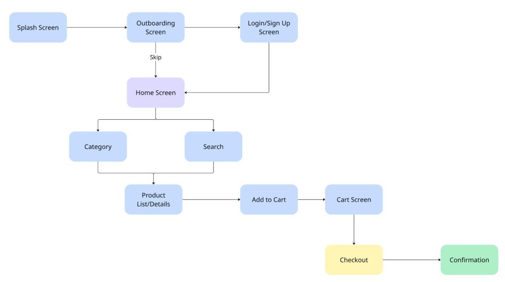
A user flow is one of mostcrucial stages of UI designing. Under this stage, designers create a diagram or a visual path that user takes to complete some desirable action on mobile app or website. By making a user flow, we get a clear idea of no of screens we need to design and what particular features needs to be added in the UI.
It helps us understand the overall journey of a user from splash screen to checkout.
Practical Example: Building a Simple User Flow in Miro
We are using Miro website to build a very simple user flow for practical explanation.
- Pick the board: Go to Miro.com, sign up and select a black board.
- Add screens as boxes: Use rectangles tool and add boxes for each screen or pages you want to include in UI. Make sure to add a label like “Home Page,” or “Login Screen,” on each rectangle.
- Show connections for user actions: Use arrows and link each box to show connections between the screens. For example, draw an arrow from “Login Screen” to “Product Category”. You can also add labels on arrow for better clarity. Like you can add “User clicks ‘Log In’.”
Additionally, you can showadditional information, questions or any assumptions in the form of sticky notes.
This is how it looks like.
Part 6: The 8px and 4px Grid System
What is grid system?
A grid system offers a set of grid, margins and columns that help us in aligning our elements properly. We can easily maintain space and build a consistent layout using a grid system.
The 8-point grid is very popular especially among the UI UX designers. This system helps in giving spacing and sizes for measurements in the multiple of 8. We also use the 4-point grid for fine-tuning the space between icons and text usually. Both iOS and Android guidelines recommend 8px grid.
Why is it important to have a grid system in UI designing?
- Visual Harmony: With a strong grid system, we can easily create a sense of order and professionalism in our designs.
- Advantage for Developers: If we make UIs on a grid system then it becomes super easy to translate into code. It is because, developers also use the same grid, margins and columns while developing an app or website.
- Skip guess work: You don’t need to guess the spacing, just follow a multiple of 8 (or 4).
Practical Example: Setting up and Saving a Grid in Figma
1. Create a frame first: Start by making a new frame using Frame tool (F). Set sizes like for mobile or desktop accordingly. If you don’t know the sizes then jump to the next section of this blog. I’ve explained the concept of sizes there.
2. Add a grid: Once your frame is ready, simply go to the Design panel on right and click on + icon under Layout grid
3. Configure your grid: Under 8 in the Size as shown in the image below.

4. Add another finer grid: Click again on the + icon to add another grid of 4px. Set its Size to 4px. Now you have a simple 8-4px grid on frame.
5. Add margin: Click the + icon again to add another grid. This time, click on the grid icon to open the settings. Now change the type from “Grid” to Columns. Set the Count to 1 and the Margin to 16px.

6. Save the style: Once you have made an ideal grid setup, it’s time to save it so that you can use it on other frames as well. Just click the Style icon (the four dots) next to the Layout grid section. Now select Create style and name it as “8px Grid.”

Now, you can apply this grid to any new frame with a single click. No need to add grid one by one. This will ensure that all the frames of our project share the common grid system.ur dots) next to the Layout grid section. Now select Create style and name it as “8px Grid.”
It’s time to start working on low-fidelity wireframes! Check the concept of taking the right size to start working on wireframes now
Standard UI Design Sizes for iOS and Android Applications
Designing for mobile apps is different from websites. In website designing, we primarily focus on pixels but there are different units of measurement in mobile apps. It is because of a wide variety in screen sizes and densities.
Just remember, that you are going to design for a single size, there are multiple sizes to adapt. That is why we use points (pt) and density-independent pixels (dp). Here points (pt) are mainly for iOS and density-independent pixels (dp) for Android apps.
Let’s Understand the Units: pt vs. dp
- iOS (Points – pt): Points gives fixed unit and are independent of device’s pixel density. It means that a 44ptx44pt sized button will roughly appear same on iPhone SE having 2x density and iPhone 16 Pro Max @ 3x density.
- Android (Density-independent Pixels – dp): DP are smart and flexible units that maintain the size across a wide range of screen densities. It means a 44dp x 44dp button will maintain its appearance properly on different screens.
Recommended Standard Sizes for UI Design
See, there is no particular correct size to pick while designing a mobile app UI. But what we do is that we select a common baseline and make the app UI on it. Then we scale it up or down to match with other screens.
For iOS
There is a widely adopted practice in which we design for the most modern iPhone with 3x density.
Follow these sizes:
- iPhone 14/15/13 Pro (@3x): 390 x 844 pt
- iPhone 15/14/13/12 Pro Max (@3x): 430 x 932 pt
Practical Tip: I recommend you to start designing on smaller size in the common iPhone models like 390 x 844 pt. It is seen that a layout that looks good on the smaller size will look good on larger screens as well.
Some Key iOS Design Considerations for you:
- Give Safe Areas: Safe area is the place that is not blocked by notch, home indicator, status bar and rounded corners. So, do not place any of the important UI elements outside of these safe areas.
- Tap Targets: As per Apple’s recommendations, we should keep a minimum touch target size of 44pt x 44pt. This size is good enough for all interactive elements that users tap.
For Android
Android comes with more fragmented device ecosystem. But still, there is a common baseline size that you can follow.
- Standard Baseline Size: 360 x 640 dp or 360 x 800 dp are good sizes to start with. They represent small to medium-sized Android phones.
Key Android Design Considerations:
- Tap Targets: Google’s Material Design recommends a minimum touch target size of 48dp x 48dp.
- Typography: Android uses sp which means scale-independent pixels for text size. Using this feature, users can select their preference on font sizes.
You can also follow these links for more details:
Android sizes:
- https://m3.material.io/foundations/layout/applying-layout/window-size-classes
- https://developer.android.com/develop/ui/compose/layouts/adaptive/use-window-size-classes
iOS Resolution:
- https://www.ios-resolution.com/
- https://developer.apple.com/design/human-interface-guidelines/layout#Specifications
Final Takeaway
So, we’ve covered a lot today and I hope this Figma guide will you in getting started your next UI project. If you want to set your full-fledged command on this skill then you must think for joining the Best UI UX design course in Delhi. This way, you will get your hands set both Figma designing and UX part.
About Author
Hi, this is Anuradha Sengar. I’m a full-time design faculty at ADMEC Multimedia. My specialization lies in brand identity designing, digital marketing and video editing.


